Services for this project
Brand development, Identity & Logo design, Poster & Print design, Webdesign, Social posts


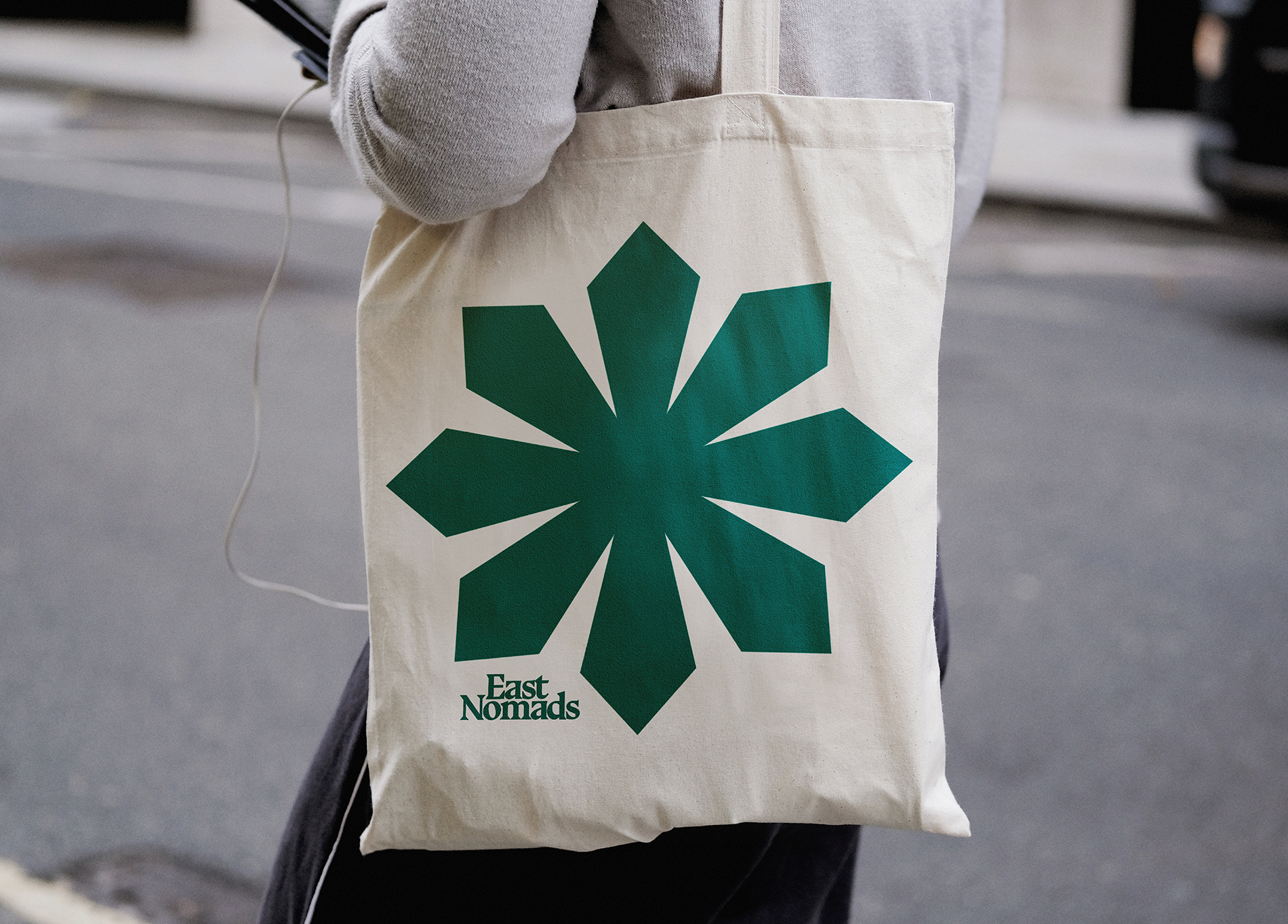


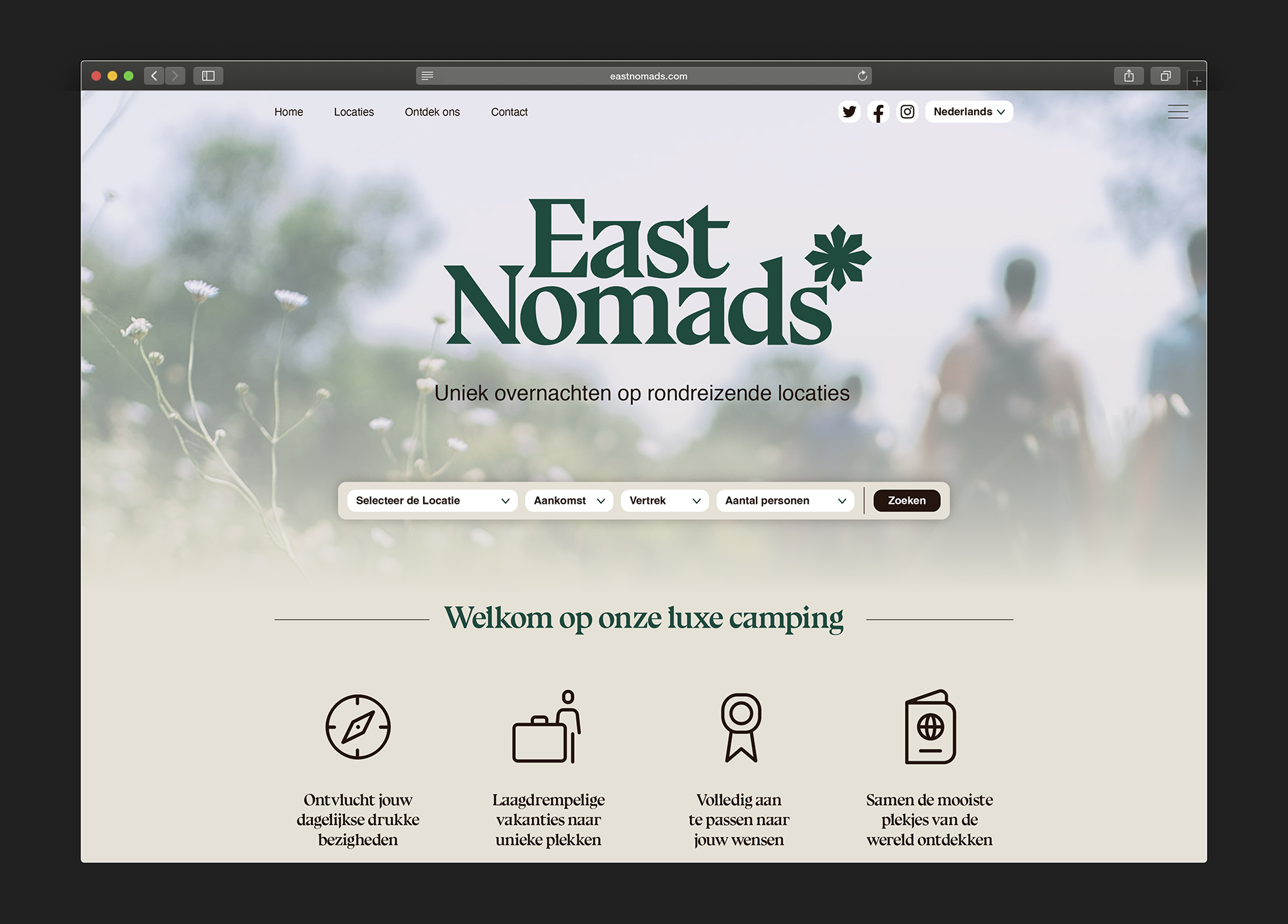
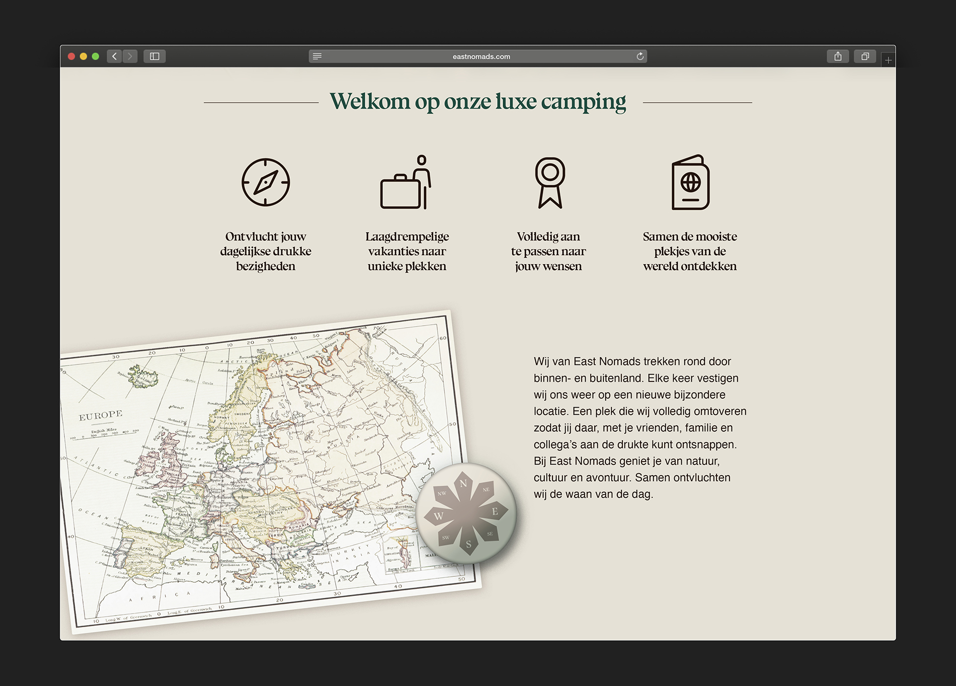
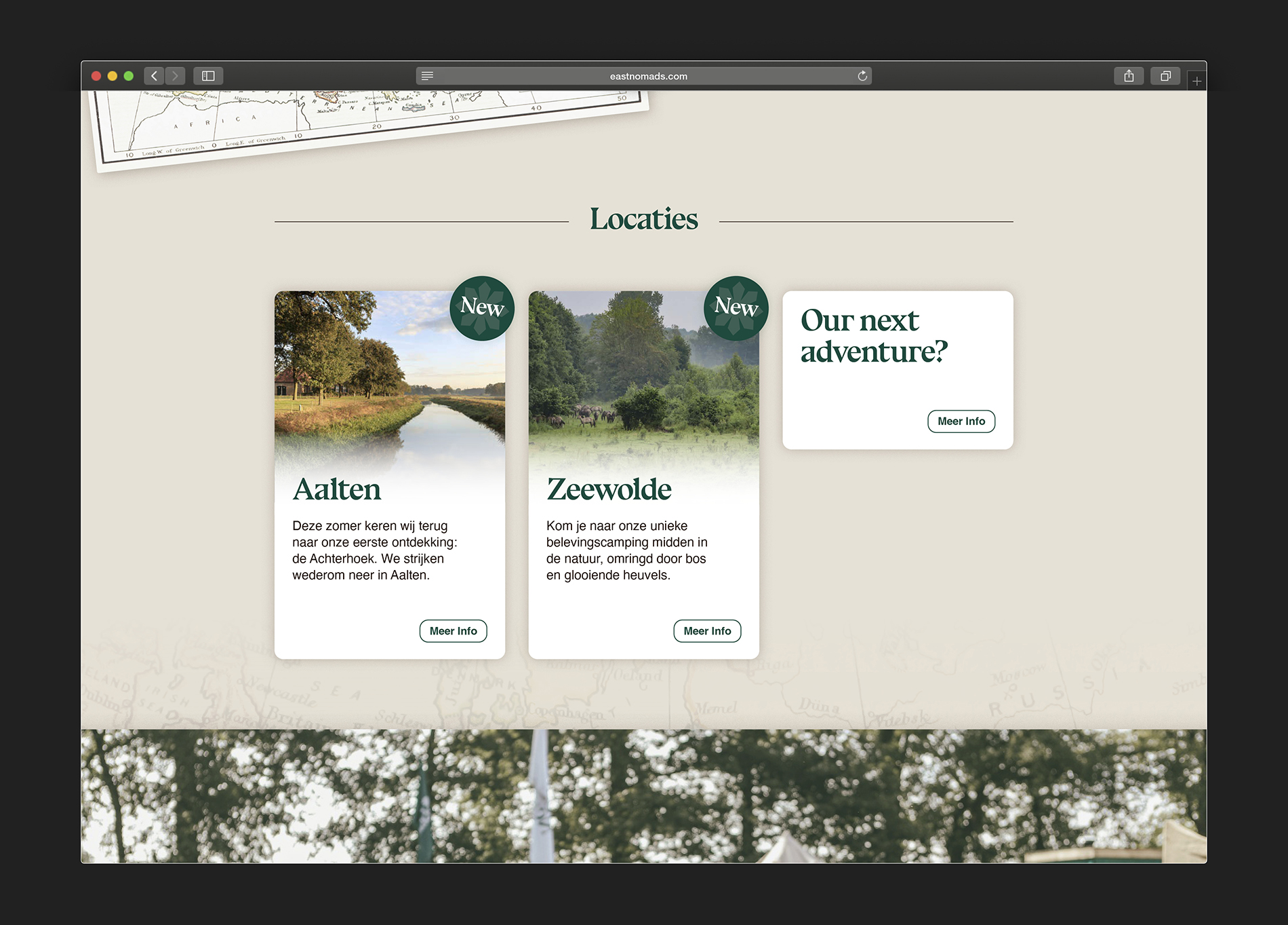
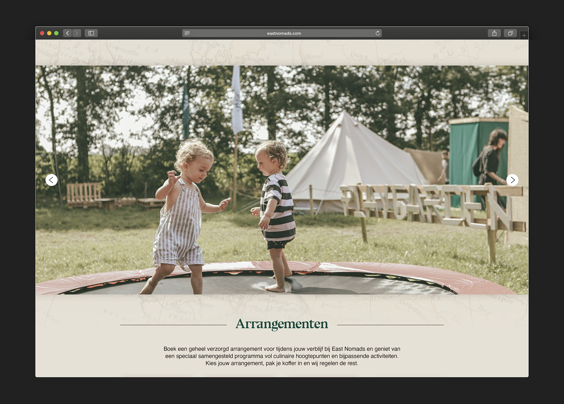
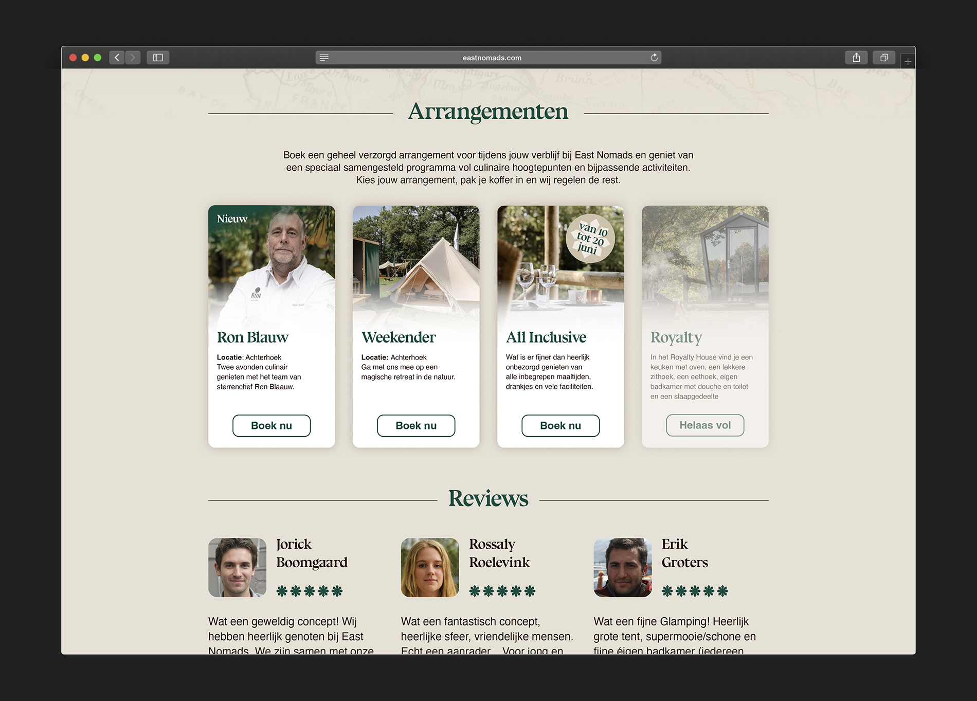

Luxurious camping, also known as 'glamping' was the first word of the briefing I got from De Burgemeesters. They asked me to create an identity for a new glamping concept initiated by ‘Deworrying’ & ‘De Burgemeesters’. With a name like East Nomads, concept ideas came quickly. With the identity design, I wanted to represent what Nomads are all about, traveling around from place to place. Back in the day, they would use the Polestar as guidance. The modern Nomads use a compass as their way-finding tool. To emphasize the importance of these tools, I choose a shape that would represent both those aspects, the asterisk (the little star symbol used for footnotes). To invigorate the Nomad concept, I looked for a typeface that would emphasize the whole Nomad vibe. A font that fits this concept extremely well is Bluu Next, which formes the basis of the entire identity. To accommodate this unique typeface, I choose a more neutral font, Helvetica. These two typefaces create a nice contrast in de overall communication. In the end, the identity became a playful combination of variance in design as well as in concept. Which is precisely what East Nomads is about, the contrast of luxury in the middle of nature.